Pudding cups, milk cartons get a makeover

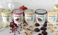
Consumers like the short list of ingredients that Kozy Shack uses for its puddings. In the package redesign, agency Webb deVlam positioned the clean label as a “recipe.”
Juggling containers, tasting pudding, meeting cows. Just another day for the teams at strategic brand design agency Webb deVlam, Chicago. In the last year, the firm has helped solve two unique business challenges within the dairy aisle. The first: find a modern audience for a heritage pudding brand. The second: make a shared mission among dairy co-op farmers to connect with more people, including new moms.
Shifting from legacy to recipe
Land O’Lakes approached the agency to help them re-energize their newly acquired Kozy Shack products, a heritage pudding brand. The task was to take this classic product and give it a fresh appeal for today’s buyer. While Land O’Lakes wanted to increase incremental sales, it also did not want to alienate a very enthusiastic base of loyalists who love the brand and its wholesome and simple products.
The agency’s insight and strategy teams began with consumers to understand what they loved about the Kozy Shack brand. They found that the simple recipe was something very different and desirable to consumers. Consumers liked that they could recognize (and pronounce) the short list of ingredients on the package. This helped the brand have an authentic “recipe” instead of a “formula” that consumers perceived of other products. However, the simple recipe uniqueness failed to come through in the packaging.
With the “recipe, not formula” insight in mind, the team began exploring visual territories the brand could own. Additional consumer feedback throughout this process narrowed and helped refine the design strategy into a single, authentic compelling brand future that resonated with loyalists and new consumers alike.
Once the design strategy was in place, the brand identity design team explored what this positioning would look like in a visual language. They focused on the key point of contact for the brand: the packaging. The team’s focus was to establish a new design system based on the idea of the simple recipe, while leveraging key visual identifiers for the brand.
Calling all moms
Organic Valley approached Webb deVlam to help get its products in the hands of more people. OV wanted to expand the reach of its mission by thinking broader than the group of very knowledgeable organic consumers that already knew and loved OV. The expanded focus started with new moms, who are the first audience to consider transitioning to organic dairy.
However, to entice this new audience, the company’s creative and packaging strategy needed a refresh to ensure that the products would stand out. Taste was now a critical factor as well, so OV needed to be sure that the taste of its organic products would not be lost in the shuffle of all of the health information surrounding organic products.
First, the agency evaluated the scope of OV’s products. Competitive intelligence was gathered to better understand the dynamics of this fast-changing category, while focus groups and shop-alongs helped inform the agency about purchase behaviors, especially of new moms. What they found was a lot of fear when it came to identifying a healthy, trustworthy organic dairy brand that would still deliver superior taste for their whole family.
The farmer’s perspective
The agency also needed to understand the point of view of OV’s farmers. Creation sessions and agency visits to their farms found that Organic Valley’s entire mission (and existence) was based on the same missions of new moms: to go above and beyond to provide the best dairy products for their families.
“Beyond the standard” became the new OV brand ambition that aligned both farmers and consumers around this single cause. The complete redesign included rethinking the entire communication hierarchy to help consumers find critical shopping information quickly while creating a strong brand block at shelf to help them really see the OV brand in any category. Integral to this new design system was utilizing actual farmers and their families in the photography to authentically show the brand’s farm-to-table purpose.
Looking for a reprint of this article?
From high-res PDFs to custom plaques, order your copy today!


